Brief
What is ShopeePay Ang Bao?
ShopeePay Ang Bao is a one-to-many transfer feature designed for users in South East Asia. It provides a clear and fun transfer experience, allowing users to send money to friends or relatives through a simple link, satisfying the need to send gifts during the festive season. Also, ShopeePay Ang Bao uses the concept of the random amount, making the transfer and receive flow more engaging.
My Contribution
I am the only designer for this product. My work carried through from pre-research to the design of the user flow, wireframe, UI Visuals, and interactions. For non-design works, I collaborated with the local CX team for user testing, worked with software developers to land the design, and defined Ang Bao Design Guideline for Local designers. The proudest things for me in this project are about exploring Lottie Animations and Using Origami Studio to conduct quantitive user tests.

Background
Business Background
Shopee is the leading e-commerce company in South East Asia, became the most downloaded e-commerce software worldwide in 2021. ShopeePay is an e-payment service inside the Shopee App, which is similar to Paypal. It helps users to complete payments in Shopee, and also supports P2P transfer, top-up services, etc.
Current Issue
There are many active Shopee users who have not gone through KYC (the process of verifying customer identity) for ShopeePay. And they usually use their debit or credit cards to complete payments for Shopee orders rather than using ShopeePay. Even those who have registered for ShopeePay and passed KYC mostly use the top-up service (topping up to pay for orders) rather than the P2P transfer service. We see this as a vicious circle of low user activity.

Business Goal
Converting Shopee users to ShopeePay users and increasing transactions of the general ShopeePay service are the main business objectives at the moment.
Hypotheses
After discussion, we decided to explore potential opportunities in P2P transfer services to achieve our business objectives. The reason for this is that P2P transfer services usually involve both a sender and a recipient. Unregistered users might be motivated to register after receiving a transfer from ShopeePay. This may lead to exponential user growth if there is a one-to-many transfer service.

Design Process
Research and Synthesis
I conducted a design study with CX team leaders in Indonesia, Malaysia, and other countries. The study used questionnaires + interviews to understand our users’ current context and motivations for using p2p transfers. The context of use is versatile and can be divided into two main types.
- transferring money to strangers: e.g. to merchants, taxi drivers (usually via QR codes or manually entering mobile phone numbers)
- transfers to acquaintances: for example, regular transfers to landlords, holiday transfers
As acquaintance transfers account for 59% of transactions, and holiday transfers are a context not currently considered in the design, it is a better entry point for starting the design.

Ideation Workshop
With the business objectives, we set a major design challenge. How might we encourage users to sign up for ShopeePay and make transfers during the holiday?
To balance the opinions of the various stakeholders, I organized a one-hour brainstorming workshop with the CX team, regional product managers, commercial team, and developers, and we came up with ideas in three directions
- IG stories type: Allow users to create their own Ang Bao covers to enhance the social experience.
- Random Amount Type: Enhance the gaming experience by randomizing the Ang Bao amount.
- Game type: Enhancing the gaming experience through the slot machine or lucky draw metaphor.
Option 2 was selected for its feasibility and user value.

User Flow and Wireframe
After having the initial idea, I quickly summarised the user stories and the following user tasks, and start to design the user flow and wireframe.
- Sender: find the Ang Bao entrance, choose the type of Ang Bao, choose the recipients, enter the amount, enter a message, choose the Ang Bao cover, select expiry time, confirm the transfer info, enter the PIN and share the Ang Bao link to friends.
- Recipient: click on the Ang Bao link, open the Ang Bao, view the amount, and check the leaderboard.


Internal Review and Test
During the internal test with stakeholders, we found some problems when testing the wireframe. For example, users found that the sending process was too long, requiring many input operations and multiple page jumps. In addition, after sending an Ang Bao, users could not find the button to share the Ang Bao, because the success page was too similar to the normal transfer success page. So after moving to the UI and interaction design, these issues were optimized.

Interaction and UI Design
Ang Bao Cover Design
To make the Ang Bao transfer feature more entertaining, we decide to animate the Ang Bao cover and export it as Lottie JSON files. Lottie was chosen mainly because of its smaller size and higher display quality. For localization purposes, the design of the Ang Bao cover will be done by a local designer, so I have also developed a set of specifications for the cover. The specification includes:
- the compositions (background decoration, mid-ground, foreground mascot)
- the artboard size of the cover
- bleed control for multi-size devices
- file export.
Through feedback, it took a while for local designers to become familiar with the Lottie animation creation process, so we decided to go with a static cover for now.

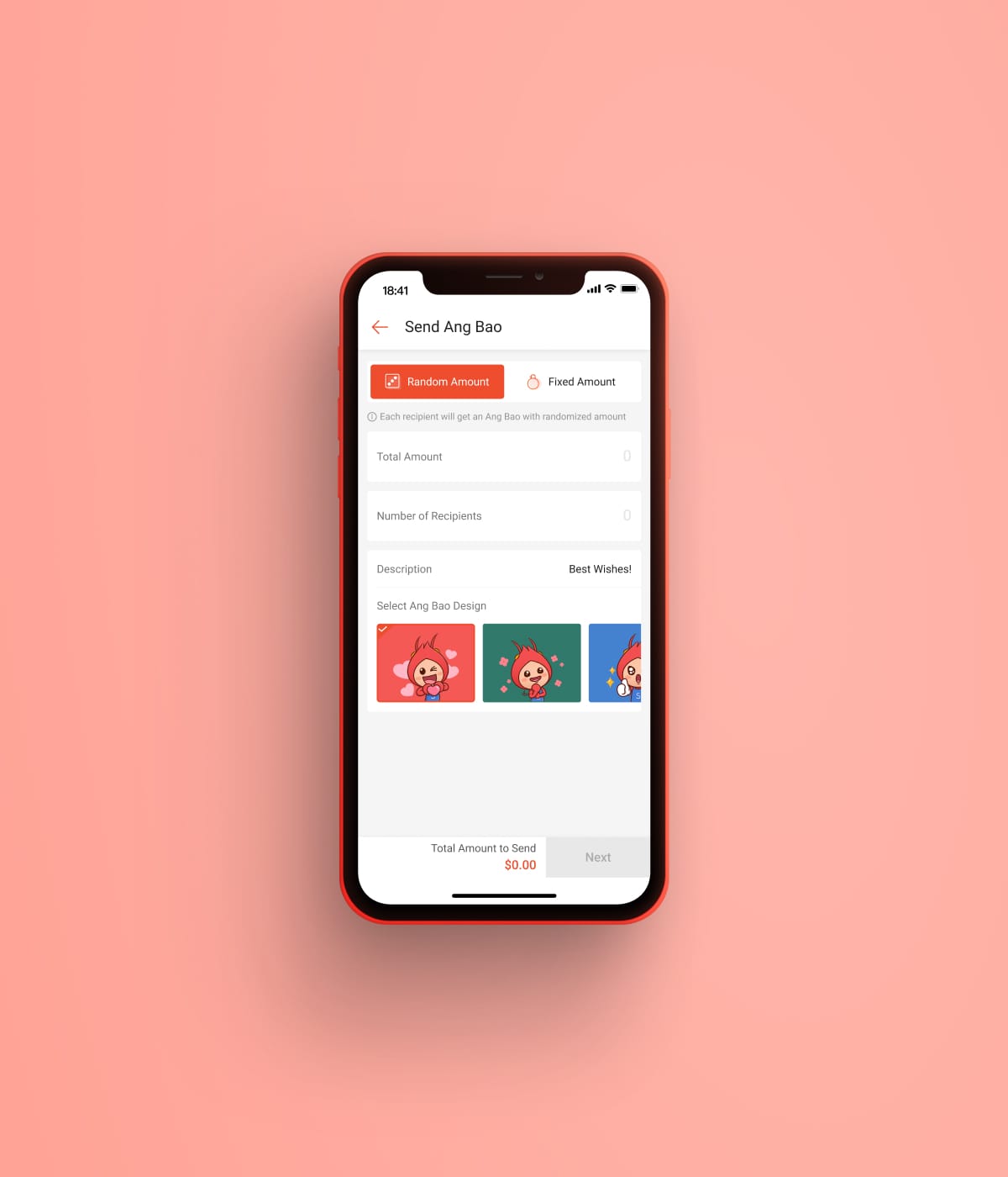
Sender Flow
The sending process has been optimized to address issues identified in previous tests, including the following points:
- selecting the recipient has been removed so that any user with a link can receive the Ang Bao transfer (reduce obstacles)
- removed the step of selecting the expiry time, the default setting is 24 hours (reduce obstacles)
- message and select Ang Bao cover combined as optional info, users can make the transfer even skipping this information (improve efficiency)
- merged the confirmation, PIN, and success pages (reduce page jumps)
- improved the Ang Bao success page to emphasize the sharing button
Recipient’s Flow
The logic of the recipient’s flow has also been partially changed to allow not KYCed users to accept the Ang Bao. However, KYC verification is necessary if the user needs to use the money from received Ang Bao. In the case of unregistered users, we also offer a quick one-click registration design to convert users quickly.
The new leaderboard is designed to stimulate discussion and bring about a competitive mindset, which could benefit the expansion of Ang Bao.
A/B Test Plan
Within the team we had concerns about the design on the sender side, one concern is about the “Select Ang Bao type”, and another is about the “Share Ang Bao button”. So I prepared two designs and prototypes by Origami Studio and conducted an A/B test.
The prototype is able to track task completion time. More specifically the “input time” and “share time”. The input time is started from the user’s click Ang Bao and ends when the user finishes input and clicks next (in this way it can measure the user’s cognitive load to recognize about fix and random amount ang bao). Share time starts from when the share button show and till the user successfully shares to WhatsApp. The sequence of users who try designing A&B and the task they perform was totally randomized to prevent biased data.


A/B Test Results
The results show that Design A is more efficient for the user performing the input tasks, the user spends around 17.89 seconds compared to 18.84 by design B. From observation, it is because design B had one more screen that need the user to click, and users tend to spend a lot of time to think the meaning of “random amount” and “fixed amount”. Two users failed on the input task in design B. The interesting thing is the users think design B is easier to understand even if they failed the tasks.
For share time, two designs have no significant winner. Design B (4.62) is just slightly more efficient than design A (4.78 seconds). From the user’s subjective evaluation, design A just slightly easier than design B. From observation, this is because most of the users in design A was instantly click the red share button after the Txn is done, cause they are familiar with default shopee sharing. But instead, they spend more time paused on design B because it looks like a complete state, and need some time to familiarise themselves with the new design.
Overall, the sending process has a SUS score of 71.9, with no obvious usability issues.


What Happened?
Learnings from this project
- Origami Studio prototype enables the possibility of quantitative usability testing
- Small animations speak louder than words (Switch Ang Bao type animation)
- Respecting stakeholder concerns (Local designers need more time to learn Lottie)
- Drive team consensus with a test results

Bussiness & UX Metrics
To better measure the success of the Ang Bao feature, the product manager and I have worked together to set metrics that can be tracked.
Business metrics:
- Ang Bao Total Transfer Number and Value
- Ang Bao Transfer Number and Value per user
- Share number
- New users of Ang Bao and ShopeePay
- CS cases relate to Ang Bao
- …
UX metrics:
- Sender & Recipient Task Success Rate
- Sender & RecipientBounce rate (per page)
- Recipient Leaderboard Error Case
- Button click time for each page